 |
| They just want you to try and stop them... |
-Looks like meat's back on the menu, boys!-
Ugluk
I know, I know... but lend me your hear: I have a proposition.
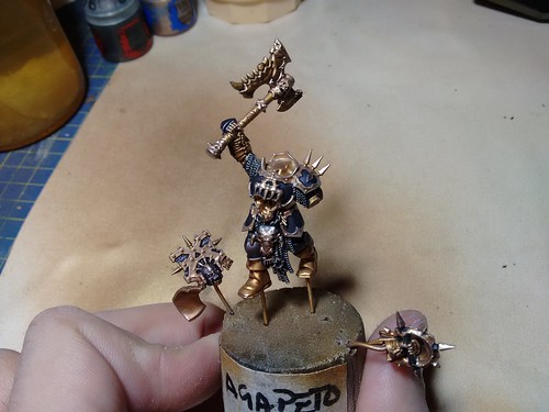
I will skip the part when I start complaining and crying about my curiously time consuming last months (trust me, there's material for a couple of movies) and I'll just get straight to these little fellas.
Deal?
Good.
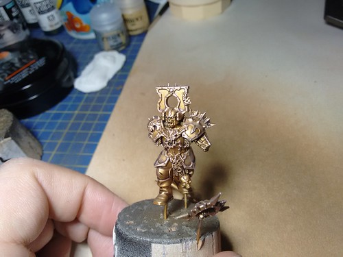
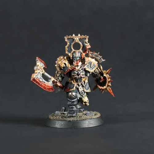
Believe it or not, the amount of time effectively spent "per miniature" on these Blood Warriors has been quite limited, compared with the endless Bloodreavers.From a certain point of view, the structure and the overall combination of parts and materials on the miniature is less chaotic, but at the end, it's all because of the sculpt, far more precise and detailed even if we're talking about the starter kit version. Clearly a couple more of detachable heads and arms would have been much easier to paint, but I'll have more time on the other guys waiting in the box.
I like the canonical red & bronze of the Khorne army, but since I want to mix my army with some Varanguard, I was looking for something "gloomier".
The knights of ruin demand some class, and a bit less cocky color scheme is strongly recommended.
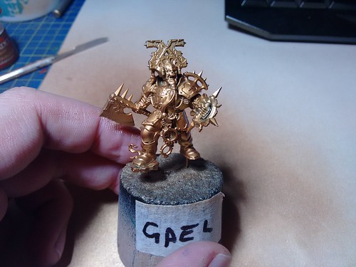
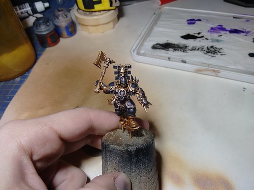
The most prominent feature of the Blood Warriors is the chiseled armor - and the dangerously ludicrous helm - so we'll start from this, even if, later, I had to curse a bit while painting the skin.
Even if I really admire the NMM technique (and sooner or later I want to give it a try on a big subject), I keep preferring the general look and feel of metallic paints, so I decided to test some minor recipes with dark colors.
To speed up the whole process, I've primed and basecoated the miniatures using the airbrush.
Nothing fancy, just multiple layers to achieve a solid smooth background, since the detailed surfaces are quite prone to pooling.
 |
| Actually not that sober... |
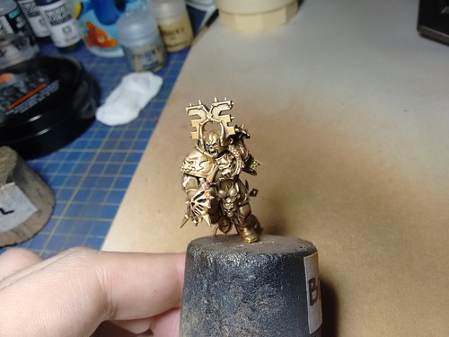
If properly airbrushed, metallic paints have an extremely polished finishing, so we can take our time with a fine grey/brow wash that will darken and desaturate the general tint.
As for the basecoat, dilute and work around the detail, avoiding pooling.
Don't waste time and focus just on the actual golden bits, since all the carved features will be painted later.
 |
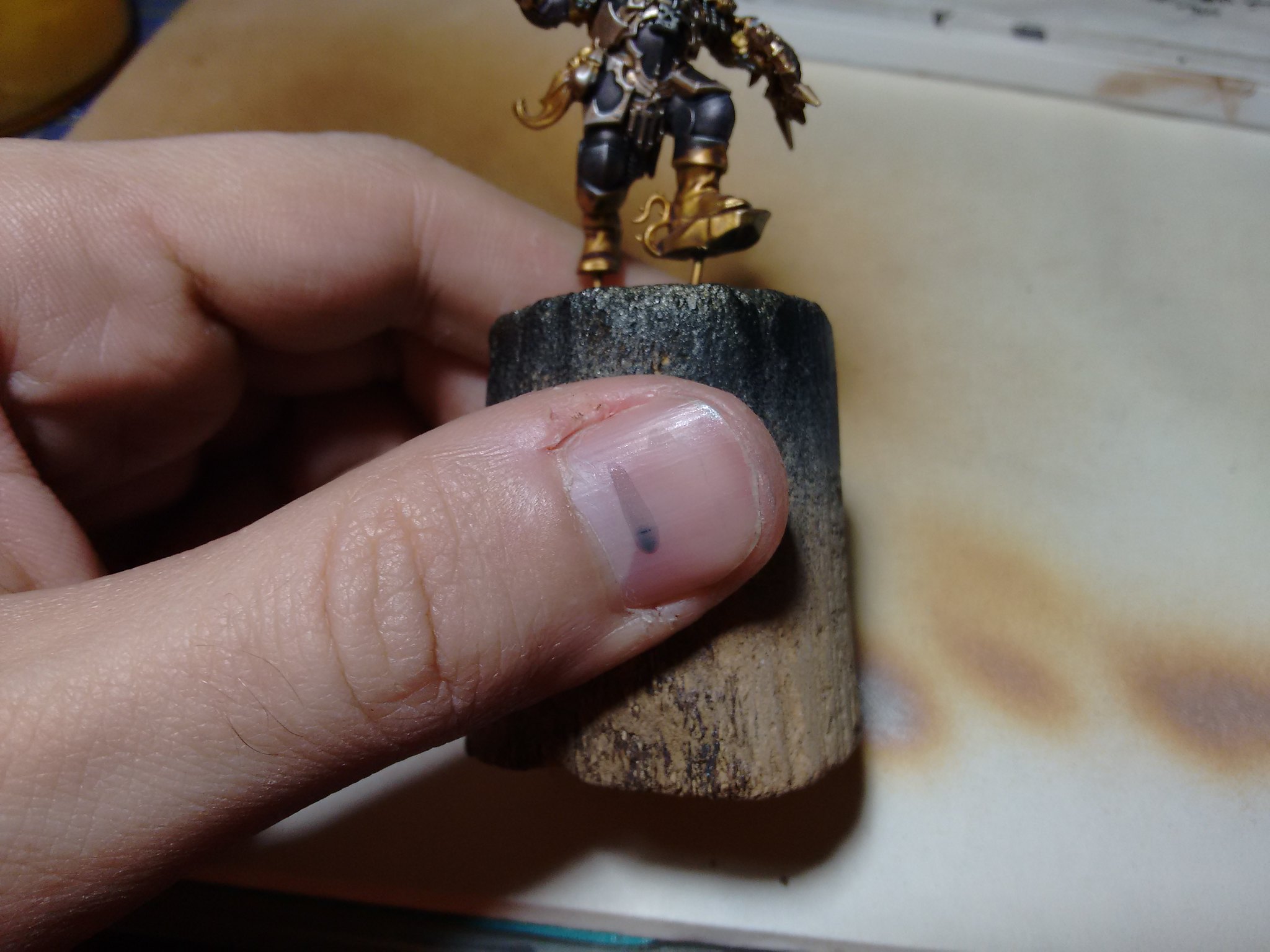
| As you can see by the paleness of my finger, the white balance may vary |
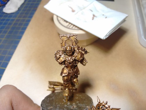
Time for some fake-azimuthal-lighting also known as one-side-drybrush. Clearly F.A.L. sounds cooler, therefore the results are better.
The first light will be a mildly desaturated golden tone (basecolor with a 10% of silver), stroking the brush just from the top to the bottom of the miniature.
The second hand will just be pure silver, but with just a minimal amount of actual color on the brush, just to catch the most protruding bits.
Clearly remember to be consistent with the stroking direction.
 |
| A bit better |
Finally, to turn the golden tone a bit more colder, a thin glaze of bronze will complete the trimming of the armor.
 |
| Mad white balancing strikes again! |
For the dark metal I tried a "ludicrous" version and a more time consuming one, favouring (you don't say?) the latter, bust since the test wasn't that bad, maybe for a bigger army you could give the former a try.
Basically, the first recipe is a single basecoat of gunmetal(40%), blue ink(10%), purple ink (10%) and black (40%) with two different dilutions. The first hand is a straight half-and-half mix with water, while the second one is a bit closer to a glaze with a 4/1 ratio.
The second hand is applied with a bit of generosity, almost like a wash, leaving a small amount of paint running along the borders.
The result is a decent metallized surface, with a little bit of extra darkness to increase the contrast.
Acceptable on tiny surfaces or to speed up the painting on large batches.
 |
| It's a bit flat, but the metal look is quite catchy |
The second recipe is a bit more complex, but still manageble on a tabletop scale.
First, a simple basecoat of a simple 50% gunmetal + 50% silver
 |
| "I don't really feel the compulsion to kill..." |
To add an "evil" touch, nothing is better than purple.
Actually a thin glaze will look more like a fairy violet, but we just need a bit of patience...
 |
| "Still not really evil..." |
Time for some black glazing. Keep in mind that this is not a wash to just tone down. It's more like "adding darkness". So insist more on the recesses and the areas that are supposed to be in shadow.
 |
| "Ok, now I feel a bit more chaotic." |
This may sound a bit time consuming, but working with a batch gives you enough time to let the paint dry and check the result after each phase.
For this one there were more or less four layers of black glaze.
|
Now for the very last shade, we need something to add a cold tone, to further help the black to "suck out" the light without wasting the metal look.
And for cold shadow Dark Sea Blue (Vallejo 898) is your man.
This tint is a really gloomy blue with a greenish tone that, properly diluted, adds that right amount of "undead" almost above any other colour.
In our case, since we already have a dark surface, we have to be suble, so just damp the brush and add some touches here and there.
A last fine highlight with pure silver, and we're done with the armor.
 |
| Just to give you an idea of the glaze thickness |
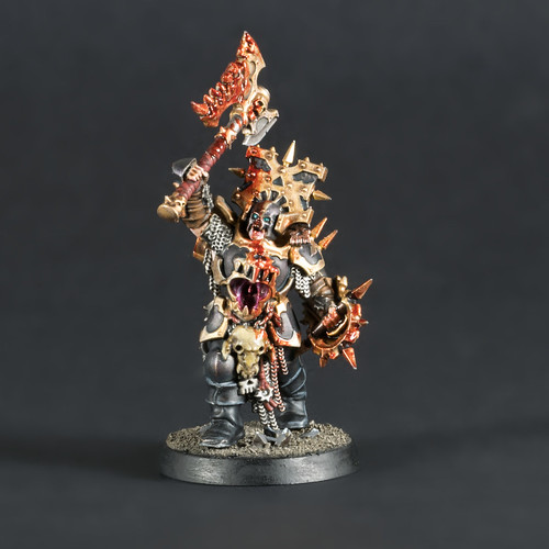
Time to improve your vocabulary and learn some new blasphemies.
As I said before, the AOS starting kit has almost no option part, therefore, the miniature are mostly in one single piece. Considering the size of the fu*king helm, painting the skin bits requires a good amount of patience and silly putty. Luckily, after the reavers, I know the drill.
 |
| The skin, anyway, adds some complexity on the structure. |
Time for some colour!
The Blood Warriors are almost completely covered with their thick armor, so we need to break the monotony, or they will just look like a boring amount of black and gold.
Weapons and leather details can help, just like the omnipresent skulls, but for some warmer tints beards and hair are just what we need for.
 |
| "Darling, what's your conditioner?" |
The overall dark scheme offers us a further aspect to play with.
Blood effects stand out dramatically well as opposed to the tipical Khorne red scheme.
Now we can add a bit of extra character, like a straight gush from a just cleaved enemy...
 |
| Say hello to my little friend... |
Or portraying a fierce refreshing drink after a long day of slaughtery...
 |
| "Put it on my tab, pal!" |
The "drama effect" clearly works better where the black is most prominent. When you already have some coloured bits like hair (and so on), less is clearly better.
 |
| "I'm so fabulous!" |
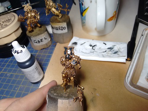
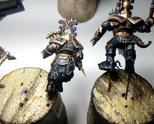
Hopefully I'll be back with some more Khorne guys pretty soon, even if the call for something bigger and mechanic (and possibly bashed) is really strong...
No comments:
Post a Comment